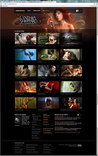
 Sheppard-arts.com
 has received its yearly facelift for 2011, including a new
mobile version for those of you who are bound by the confines of the modern smartphone.
I spent a little more time planning out this year's revisions than last, and more time thinking of myself as a brand. Some new features include:
-An official
Cynthia Sheppard Illustration logo.

It's high time I had a single image that I can carry across all my promo items. I was inspired by some of my cohorts such as
Sam Flegal who established his "Strange like Sam Flegal" brand last year.
-Bigger thumbnails.
1. I got a lot of comments like "make the thumbnails bigger!" hehe.
2. I still opt for a lightbox image viewer over a slideshow or full-page-scroll format because the proportions of my images are all different, so they look disorganized or don't read/resize well in a fixed window. One AD mentioned that using a lightbox can be cumbersome, especially if the window overlay doesn't allow you to right-click/save the pictures. So to make his life easier I chose a version that
does allow people to save, and increased the thumbnail sizes so he and other ADs can better jog their memory of what a painting looked like without having to click on anything.
-A dropdown menu for external links/social media and to share the site on facebook.
I'll probably add some more sharing-via-social-media options later, but I want to test Facebook first to see what kind of traffic is generated.
-The removal of unnecessary sections.
My painting tutorials will still be available, but since I rarely had time to update them, having a whole page dedicated to them was dead weight. The majority of people that come to the site are there to see the artwork or to find out how to contact me, so I also nixed the Resume section in favor of a small and tidy client list on the homepage.
Enjoy!